HIFI Diary: Demystifying Frequency Response Curves and Waterfall Plots
Hi-Fi: From Beginner to Cremation Series
[Expand / Collapse]
-
Hi-Fi Beginner’s Q&A
Quick answers to common questions for beginners
-
How to Judge and Describe Sound Quality?
An analysis of key stages affecting sound quality and understanding audio characteristics
-
What is a DAC? What is a Decoder?
In-depth analysis of the differences between DAC chips and dedicated decoders
-
A Brief Introduction to Digital Audio Formats and Technologies
An all-in-one guide to digital audio formats
-
What Are Bluetooth Codecs SBC, aptX, AAC, and LDAC?
A complete breakdown: which Bluetooth codec is the best?
-
From the Basics to Depth: Understanding Frequency Response Curves and Waterfall Plots
A quick guide to reading 2D and 3D spectrograms
-
How to Choose and Buy Hi-Fi Gear? How to Filter Useful Information?
A practical buying guide and pitfalls to avoid when shopping for Hi-Fi gear
-
How to Choose Desktop Speakers?
Buying desktop speakers from scratch
-
Building a DIY Hi-Fi Setup Just Like a DIY Custom PC
Step-by-step workflow for assembling a complete Hi-Fi system
-
Can’t Tell the Difference Between MP3, Lossless, and Hi-Res? Try the Golden Ears Test
The legendary Golden Ears test is here!
-
Amplifier Power Calculation and Technical Demystification
Not sure if your amp has enough driving power? Let this dedicated calculator help you
-
DIY High-Performance Music Server
Hands-on building a PC CORE and exploring its impact on sound quality
-
Selection and Discussion of Ethernet Cables
Exploring the impact of network cables on sound quality
-
Principles and Exploration of Hi-Fi Network Switches
An analysis of the principles behind the trending Hi-Fi network switches
-
The Ultimate Audio Mysticism: Grounding Box Comparative Test
A hands-on comparative review of multiple audio grounding box brands
-
Audio Solder Comparison
Exploring the sonic differences between various solders in DIY audio cables
-
Head-to-Head Comparison: Audio Fuses from $0.30 to $200
Comprehensive comparison across numerous fuse models and amperage ratings
-
AudioQuest Diamond / Wireworld Platinum Starlight 7 / W4S / Xianyu Handmade I2S/HDMI Cable Comparison
Sound comparison of HDMI cables from multiple Hi-Fi brands
-
How USB Cables Affect Sound Quality
USB cable selection and exploration of its impact on sound quality
-
Starting from SATA Data Cables: Discussing the Chaos of DIY Audio Cables
An in-depth look into Hi-Fi SATA cables
Recently, the BLOG owner noticed some friends discussing frequency response curves and found that quite a few people still have a rather one-sided understanding of the topic. Therefore, the BLOG owner would like to share some thoughts on frequency response curves, helping everyone truly understand what frequency response curves and the associated waterfall plots actually are, and what practical purpose they serve.
1. What is a Frequency Response Curve?
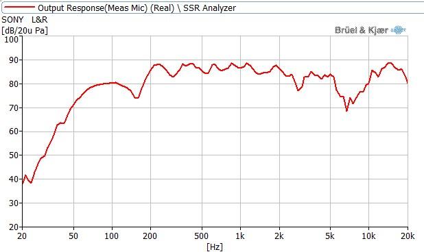
The typical frequency response curve we see is shown above. In this chart, the vertical axis represents loudness (dB) and the horizontal axis represents frequency (Hz); the curve indicates the instantaneous loudness at each specific frequency. Simply put, a frequency response curve allows us to observe the maximum loudness of sound across different frequency bands. A relatively ideal frequency response curve should tend toward flatness with minimal fluctuations.
2. What Purpose Does a Frequency Response Curve Serve?
Before understanding the role of frequency response curves, we first need to understand the frequency ranges of different sounds:

From the chart above, we can see that various musical instruments and vocal ranges occupy different frequencies. By examining the frequency response curve, we can gain a general idea of the relative loudness across these different instruments and vocals.
So what practical use do these loudness profiles actually have? To sum it up in one sentence: not much. Because a frequency response curve only reflects the loudness at particular frequency bands, relying solely on the curve only allows us to roughly judge the “quantity” of a certain band. For example, issues frequently described by audiophiles such as “bloated bass”, “hollow midrange”, or “piercing treble” are caused by prominent peaks in the corresponding frequency response. Conversely, complaints like “thin bass”, “recessed vocals”, or “dark treble” are generally caused by dips, or “valleys”, in the frequency response.
However, that is virtually all a frequency response curve can show. It merely provides very approximate data, falling far short of determining whether a playback device is good or bad. Below, let the BLOG owner explain why.
3. Equal Loudness Contours:
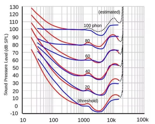
In 1933, two American scientists researching at Bell Laboratories, Harvey Fletcher and Wilden Munson, published a paper on human auditory perception in the Journal of the Acoustical Society of America titled “Loudness, its definition, measurement and calculation”. Their research revealed that the human ear’s perception of loudness is not uniform across all frequencies; the ear’s sensitivity to different frequencies changes with overall sound volume.
In plain English, human perception of frequency is profoundly influenced by overall sound loudness. At low volumes, the ear’s sensitivity to both high and low frequencies drops significantly, whereas as volume increases, this discrepancy narrows. More specifically, below 1 kHz, the lower the frequency, the higher the SPL required to achieve the same perceived loudness as other frequencies. Above 6 kHz, human auditory sensitivity also experiences a noticeable decline.
Second, there is the natural attenuation caused by human ear anatomy. Due to the physical structure of the outer ear and ear canal, by the time sound travels into the ear and reaches the eardrum, distortion has already been introduced. An even more significant factor is the physiological adaptation shaped throughout human evolution. For instance, human hearing is exceptionally sensitive to sounds around 3 kHz, largely because an infant’s cry falls precisely within this frequency band, leading humanity over countless millennia of evolution to develop heightened sensitivity in this specific range.
Due to all these reasons, simply looking at a frequency response curve is completely inadequate for “judging whether audio equipment is good or bad.” Even though we often hear that a good Hi-Fi device should strive for a flat frequency response—that a curve without peaks or valleys is an ideal curve—even a sound with a perfectly flat frequency response will naturally become non-flat once received and perceived by the human ear. Faced with this reality, how do Hi-Fi manufacturers address the issue?
4. Harman Target Curve
When discussing how manufacturers tackle frequency response, one cannot avoid mentioning the famous “Harman Target Curve.” Developed by audio engineers at Harman Kardon based on listening environments, human ear acoustics, and playback device characteristics, the Harman Target Curve is a standardized “tuning” target designed so that the sound ultimately perceived by human ears approaches perceptual flatness—in other words, “perceptually flat.” Consequently, the Harman Target Curve serves as Harman Kardon’s benchmark when engineering playback gear, reflecting its sound signature and tuning philosophy.
However, it is crucial to note that the Harman curve merely represents Harman Kardon’s own tuning preference rather than an absolute industry standard. Other manufacturers, such as Sony, Sennheiser, and Beyerdynamic, each have their own house tuning curves, which help preserve brand heritage and sonic recognizability across product generations. But if asked whether any curve truly guarantees that the final sound entering human ears is flatter or more “Hi-Fi,” the BLOG owner can only remark that Asian ears and European ears are noticeably different even in physical appearance.
5. What is a Waterfall Plot?
Let us return to the topic of frequency response curves. As mentioned earlier, frequency response curves can shed light on issues like “bloated bass”, “hollow midrange”, or “piercing treble” to some extent. We know that sound is produced by vibration; without artificial intervention, sound naturally decays over time as amplitude diminishes. This introduces a crucial concept: “decay time.” Taking the earlier example of “excessive bass,” low frequencies with rapid decay feel clean and punchy, whereas slow decay makes the low end sound sluggish and boomy. Applied to vocals, a midrange with fast decay yields clean, airy vocals, while slower decay creates a fuller, warmer, and more atmospheric midrange. A 2D planar frequency response chart cannot illustrate the speed of decay; hence, a 3D frequency response plot incorporating a Z-axis (time axis) was created—this is known as a waterfall plot.
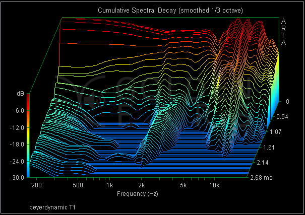
As shown in the image, this is the waterfall plot of Beyerdynamic’s flagship headphone, the T1. We can clearly observe that in the 100 Hz–1,000 Hz region where vocals predominantly reside, the T1 exhibits exceptionally fast decay, which aligns perfectly with its studio monitor sound signature. Therefore, compared to a standard frequency response curve, a waterfall plot carries significantly more information and serves as a much more accurate basis for evaluation.
At this point, readers should have a solid grasp of both frequency response curves and waterfall plots. To be sure, both frequency response curves and waterfall plots hold meaningful reference value when shopping for audio products. However, it is hard to determine whether a product is good or bad solely based on loudness and decay, especially given that there is currently no universally accepted industry standard for “what defines good sound.”
We often observe that some manufacturers like to post frequency response curves on product presentation pages for reference. Let us dive a bit deeper to see what significance frequency response curves and waterfall plots hold across the broader audio industry.
1. For Audio Professionals
As we know, Hi-Fi represents a very niche segment within the overall audio industry. Hi-Fi naturally emphasizes subjective, emotional perception, which creates an irreconcilable contrast with audio industry professionals who must view audio through technical rigor and specialized expertise. For instance, when listening to a Teresa Teng track, a Hi-Fi enthusiast might describe it poetically: “Teresa sounds like she just got several years younger!” Meanwhile, an audio professional, such as a mastering engineer or DJ, would say: “You’ve got a 3 dB boost at 500 Hz!”
In reality, the Hi-Fi enthusiast and the audio engineer are often expressing the exact same underlying sonic trait. But for ordinary enthusiasts, subjective terminology is the natural way to convey feelings; it requires no deep technical knowledge or extensive ear-training exercises, and as long as both parties share a similar cultural background, this form of expression is easily understood. However, there is no denying that such descriptions are highly abstract and ambiguous—they cannot establish objective standards or accurately quantify acoustic changes. For professionals, such communication is not only inefficient but practically useless. Therefore, relying on precise parameters such as frequency and decibel levels is entirely standard practice for audio professionals.
2. For Hardware Developers
For hardware manufacturers and developers, the direct value of frequency response curves becomes surprisingly limited. In most cases, it serves merely as a rough guiding reference, and often not even that. Let us once again take Beyerdynamic as an example.
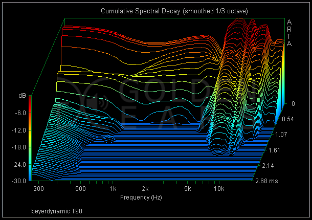
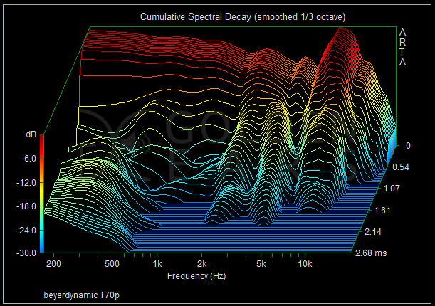
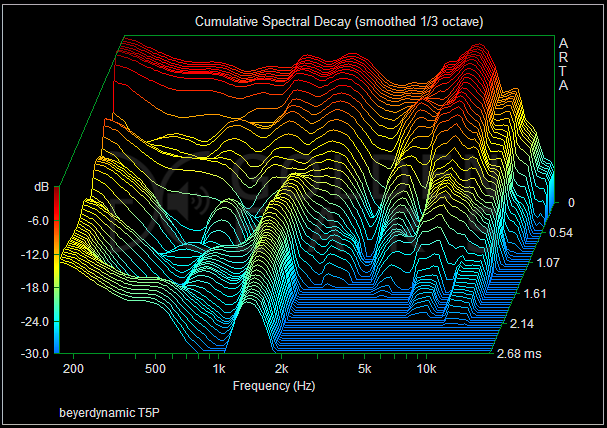
As can be seen, the waterfall plots of three high-end headphones from the same line—the T90, T70P, and T5P—each exhibit a distinct, individual sonic character with little family resemblance or linear succession. It can be said that the subtle acoustic nuances of modern end-user audio gear are still sculpted primarily through the personal experience and listening evaluations of audio engineers, with waterfall plots utilized merely for reference and debugging.
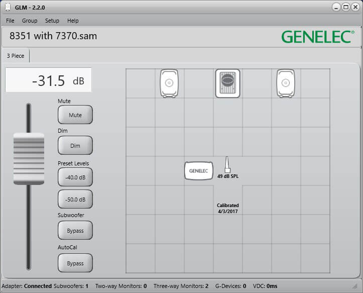
Naturally, there are notable exceptions. Rigorous studio monitor manufacturers, for example, pay meticulous attention to frequency response curves during product development. Take the renowned Finnish manufacturer Genelec: the AutoCal feature within their GLM (Genelec Loudspeaker Manager) software enables precise calibration and optimization of frequency response, phase response, and room parameters for every monitor in any studio environment.
3. For Production Manufacturers
What many people might not realize is that the greatest practical utility of frequency response curves lies in factory manufacturing. In short, its primary role is “quality control.” Many classic products remain in continuous production for decades—models like the Sennheiser HD 650 and AKG K701 have been on the market for years, not to mention Grado’s lineup, which spans decades. Throughout this long lifespan, raw materials and suppliers undergo multiple revisions. Frequency response measurements play an indispensable role in ensuring that current production units conform to the original acoustic design and maintain unit-to-unit consistency over the years. Additionally, during QA testing, frequency response curves verify driver matching and channel balance, representing a vital and widespread application.
That concludes this introductory guide. There is much more technical knowledge surrounding frequency response curves and spectrograms that was not covered in detail here, as it leans heavily into specialized acoustics with less direct relevance for casual Hi-Fi enthusiasts. Interested readers are warmly encouraged to research and explore further on their own.


You May Also Like
HIFI Diary: A Detailed Primer on HIFI Cables – The Power Cord Edition

HIFI Diary: An In-depth Analysis of the Global Music Report 2026